Cursor Spotlight hover effect
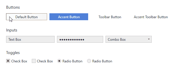
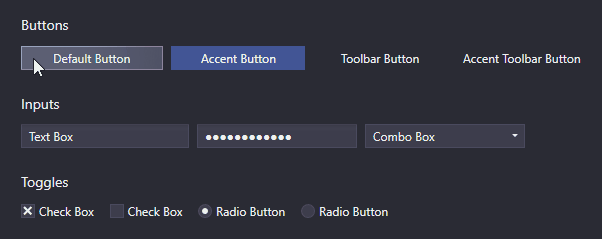
UI Controls like Buttons, TextBoxes, ComboBoxes, ListBoxes etc. that rely on interaction make use of a hover effect called Cursor Spotlight here. It makes a layer visible around the cursor when hovering over the control that is hidden otherwise. It works for both color schemes.
Customization
Properties of the ripple effect can be customized using the CursorSpotlightExtension.
Colors
The Cursor Spotlight has a background brush and border brush that can be controlled. By default, the IntenseHighlight colors of the current layer are used (see Colors and Brushes). Changing them will change every Cursor Spotlight of Adonis UI. Alternatively the colors can be changed for individual controls or styles using the CursorSpotlightExtension:
<!-- xmlns:adonisExtensions="clr-namespace:AdonisUI.Extensions;assembly=AdonisUI" -->
<Button adonisExtensions:CursorSpotlightExtension.BackgroundBrush="Red"
        adonisExtensions:CursorSpotlightExtension.BorderBrush="Red"/>
Spotlight size
The Cursor Spotlight uses an ellipse that has 75% of the size of its hosting UI control by default. This can be changed by either overriding the global setting of Adonis UI or using the CursorSpotlightExtension to set the value only on parts of your application.
Override the global value by assigning a new value to the respective key after including Adonis UI in your App.xaml:
<system:Double x:Key="{x:Static adonisUi:Dimensions.CursorSpotlightRelativeSize}">0.75</system:Double>
Alternatively the value can be set only to a part of an application like a window which will be inherited to all children:
<Window xmlns:adonisExtensions="clr-namespace:AdonisUI.Extensions;assembly=AdonisUI"
        adonisExtensions:CursorSpotlightExtension.RelativeSpotlightSize="0.75"/>
Blur radius
The spotlight ellipse has a blur effect applied that has a blur radius of 75% of the spotlights size. To protect from performance issues it has a maximum of 128px by default. This maximum can be changed using the CursorSpotlightExtension.
<Window xmlns:adonisExtensions="clr-namespace:AdonisUI.Extensions;assembly=AdonisUI"
        adonisExtensions:CursorSpotlightExtension.MaxBlurRadius="128"/>
Setting it to a smaller value will result in harder edges.
Applying the effect to custom controls
The Cursor Spotlight effect works with OpacityMasks and that’s why it is not limited to lightening up UI controls. It can be used to show an hide pretty much everything that can be rendered with WPF. To apply the Cursor Spotlight effect to a control yourself, the CursorSpotlightExtension.MouseEventSource must be set. This triggers the initialization of the effect on the control that has the property. It should be set to the control that receives the mouse events.
<!-- xmlns:adonisExtensions="clr-namespace:AdonisUI.Extensions;assembly=AdonisUI" -->
<Border adonisExtensions:CursorSpotlightExtension.MouseEventSource="{Binding RelativeSource={RelativeSource Self}}"/>