Data validation
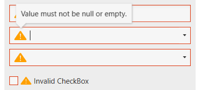
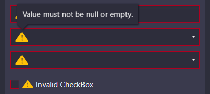
The data validation mechanism of WPF provides the ability to validate property values and assign error messages in case they are invalid. With Adonis UI, if a control binds to an invalid property the error is indicated in the control template by a red border and an error icon. The error message is displayed as a popup when the control gains keyboard focus or the user hovers over the icon. To set validation errors the interface IDataErrorInfo or INotifyDataErrorInfo from WPF can be used.
Adonis UI displays data validation errors for the following controls:
- CheckBox
- ComboBox
- DatePicker
- PasswordBox
- TextBox
Customization
Colors
The error template makes use of ErrorColor for the control’s border and AlertColor for the error icon. Both can be changed for each color scheme (see Colors and Brushes).
Validation message popup
By default the error message popup is displayed on keyboard focus and mouse hover. Both can be disabled separately using AdonisUI.Extensions.ValidationExtension.
<!-- xmlns:adonisExtensions="clr-namespace:AdonisUI.Extensions;assembly=AdonisUI" -->
<TextBox adonisExtensions:ValidationExtension.IsErrorMessageVisibleOnFocus="True"
         adonisExtensions:ValidationExtension.IsErrorMessageVisibleOnMouseOver="True"/>
Additionally, the popup can be configured to be placed below the error icon instead of being placed above.
<TextBox adonisExtensions:ValidationExtension.ErrorMessagePlacement="Bottom"/>