Layering system
In UI design it is common to have containers grouping items that belong together. In WPF this can easily be achieved using GroupBoxes for example. If the container has a different background color assigned to better differentiate between the grouped items and their surroundings, color contrast can become an issue. Gray buttons might look good on a white application background in the first place, but when they are moved into a GroupBox that has a gray background as well, they can loose visibility.
That is why Adonis UI introduces a simple layering system which automatically adjusts the colors of UI controls depending on the layer they belong to. The feature is completely optional but recommended to use if containers are nested.
| Light Color Scheme | Dark Color Scheme |
|---|---|
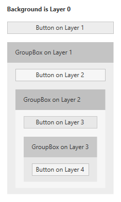 | 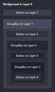 |
The difference between the shown images might not be obvious at first but is clearly visible for the buttons on layer 1 for example. Without using the system all instances of Button have the same background color. When this color is used as a background color for the container like it is for the GroupBox, the Buttons can become kind of hard to sport. When using the layering system, the background colors of the GroupBoxes are set automatically and the contained Buttons are adjusted in their colors.
By default, a window starts on layer 0 with all of its UI controls being on layer 1. To tell AdonisUI that a container represents a different layer, the IncreaseLayer property can be set:
<!-- xmlns:adonisExtensions="clr-namespace:AdonisUI.Extensions;assembly=AdonisUI" -->
<GroupBox adonisExtensions:LayerExtension.IncreaseLayer="True">
Or alternatively the layer can be forced to a specific value by setting the Layer property:
<!-- xmlns:adonisExtensions="clr-namespace:AdonisUI.Extensions;assembly=AdonisUI" -->
<GroupBox adonisExtensions:LayerExtension.Layer="1">
The Layer property is inherited to all child controls which makes items like Buttons contained in this GroupBox being automatically on layer 2. Exceptions can be made as well by applying the property to specific items. Currently Adonis UI supports nesting of such containers up to layer 4. GroupBoxes increase the layer by default. The colors of all components on all layers can be adjusted to match one’s preference as shown here.
Controls which increase the layer automatically
Following controls increase the layer for their children by default:
- GroupBox
- StatusBar
- TabItem
Adding layering support to custom controls
Controls that are not styled by Adonis UI obviously do not respect the layering system. If you want to add support to a control yourself, you can look at a default style of Adonis UI like the ones for buttons or text boxes as a reference. Make sure you understood the Colors and Brushes system of Adonis UI as well.
Set at least the Background and BorderBrush of the control to the respective brushes of layer 1. Add data triggers targeting LayerExtension.ComputedLayer to adjust the brushes depending on the current layer. Add additional data triggers that activate when being on a specific layer and having the mouse over the control. Those should set Background and BorderBrush to the Highlight brushes of the respective layer.