Window
Adonis UI brings a custom window title bar which looks exactly like the Windows 10 title bar by default but has several advantages which are explained below. To make use of it, all your window classes have to be derived from AdonisUI.Controls.AdonisWindow.
Be aware that even though the window mimics the look and behavior of the Windows 10 window, it is a complete rebuild whose look is no longer controlled by the operating system. This means that it will look like this on all operating systems and does not change to the Windows 7 aero style on Windows 7 for example.
 |  |
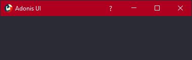 | 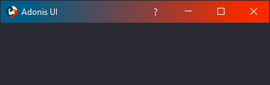 |
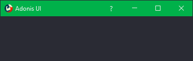
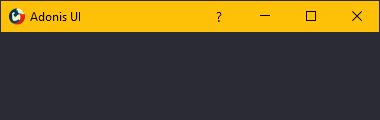
Colors
To set the colors of the window’s title bar the following properties can be used:
TitleBarForeground- Sets the foreground brush of the window title and the window buttonsTitleBarBackground- Sets the background brush of the window’s title barWindowButtonHighlightBrush- Sets the background brush for the window buttons on hovering
Title bar content
By default, the title bar consists of the application icon on the left, the window title next to it and the window buttons on the right. The AdonisWindow class offers the following properties to modify this setup:
IconVisibility- Sets the visibility of the application iconTitleVisibility- Sets the visibility of the window titleTitleBarContent- Sets content into the area between the title and the window buttons
When adding buttons to the title bar, the WindowButton style can be used to make them appear equal to the default window buttons.
<adonisControls:AdonisWindow xmlns="http://schemas.microsoft.com/winfx/2006/xaml/presentation"
                             xmlns:x="http://schemas.microsoft.com/winfx/2006/xaml"
                             xmlns:adonisUi="clr-namespace:AdonisUI;assembly=AdonisUI"
                             xmlns:adonisControls="clr-namespace:AdonisUI.Controls;assembly=AdonisUI">

    <adonisControls:AdonisWindow.TitleBarContent>
        <StackPanel Orientation="Horizontal"
                    HorizontalAlignment="Right">
            <Button Content="?"
                    Style="{DynamicResource {x:Static adonisUi:Styles.WindowButton}}"
                    FontFamily="Segoe UI"
                    FontSize="14"/>
        </StackPanel>
    </adonisControls:AdonisWindow.TitleBarContent>

</adonisControls:AdonisWindow>
Title bar size
The title bar aims at behaving exactly like the default native title bar. That’s why it shrinks a little when the window is maximized.
This can be disabled by setting ShrinkTitleBarWhenMaximized on AdonisWindow to false.
<adonisControls:AdonisWindow ShrinkTitleBarWhenMaximized="False"/>
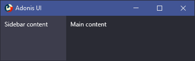
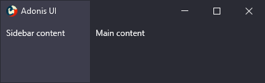
Title bar over content
By default, the title bar is stacked on top of the window contents. You might want to draw it directly over the window contents for a blending effect. You can do this by enabling the PlaceTitleBarOverContent property. Unless specified otherwise, when enabling this property, the title bar background will also be set to transparent.
Note that you will likely have to set the correct margin for some of your window elements as well. You can do so by binding to the TitleBarActualHeight property:
<adonisControls:AdonisWindow xmlns="http://schemas.microsoft.com/winfx/2006/xaml/presentation"
                             xmlns:x="http://schemas.microsoft.com/winfx/2006/xaml"
                             xmlns:adonisUi="clr-namespace:AdonisUI;assembly=AdonisUI"
                             xmlns:adonisControls="clr-namespace:AdonisUI.Controls;assembly=AdonisUI"
                             PlaceTitleBarOverContent="True">
    <Grid>
        <Grid.ColumnDefinitions>
            <ColumnDefinition Width="256" />
            <ColumnDefinition />
        </Grid.ColumnDefinitions>
        <GroupBox Grid.Column="0"
                  Padding="0">
            <StackPanel>
                <Border Height="{Binding Path=TitleBarActualHeight, RelativeSource={RelativeSource AncestorType={x:Type adonisControls:AdonisWindow}}}" />
                <TextBlock Margin="{adonisUi:Space}">Sidebar content</TextBlock>
            </StackPanel>
        </GroupBox>
        <StackPanel Grid.Column="1">
            <Border Height="{Binding Path=TitleBarActualHeight, RelativeSource={RelativeSource AncestorType={x:Type adonisControls:AdonisWindow}}}" />
            <TextBlock Margin="{adonisUi:Space}">Main content</TextBlock>
        </StackPanel>
    </Grid>
</adonisControls:AdonisWindow>
TitleBarActualHeight will conveniently return 0 if PlaceTitleBarOverContent is disabled.
 |  |